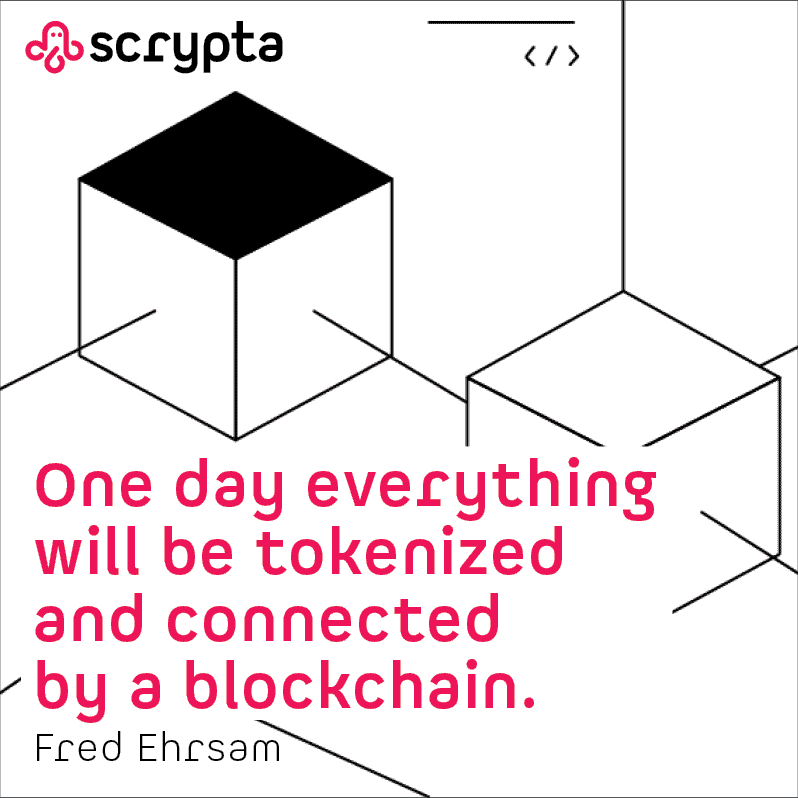
This was a light redesign job for a company operating in the blockchain field. The pre-existing pictogram had several problems, but between the choice of making a new design with a more serious image and a lighter intervention while keeping the sympathetic look, the second option was chosen. The one color in use previously, which was very close to magenta, was joined by black and white as well as a color to be used for the backgrounds. The typographic part was also changed with the use of the “Spock” font, a sans-serif font used in only two weights, light and bold that is characterized by its simplicity combined with features that make it very original. In addition to the logo, other brand elements were studied to be applied to the website and communication.