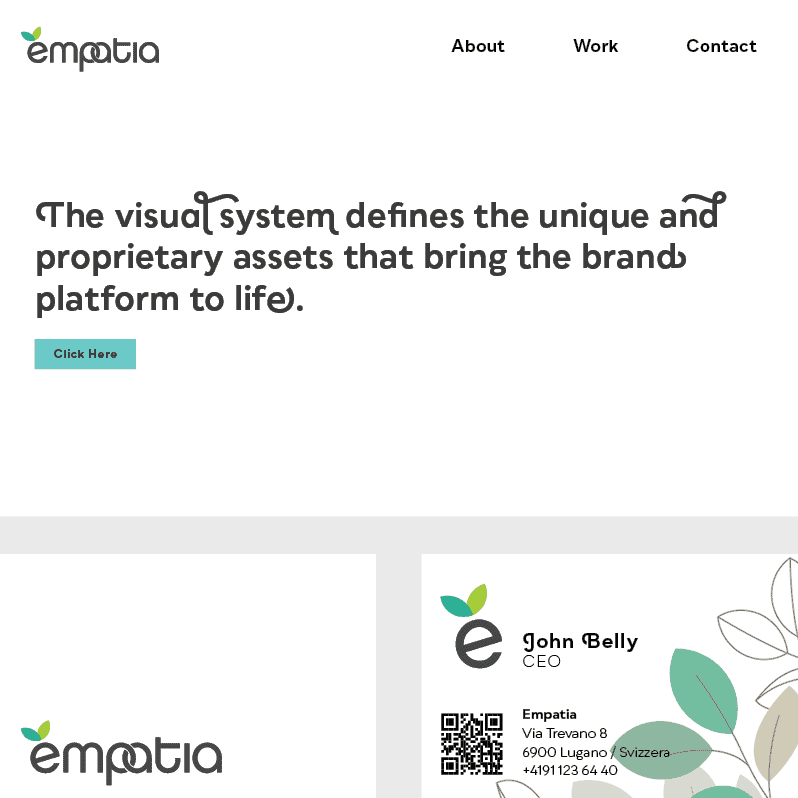
Empathy is a Swiss brand with many products in the body wellness area. The key concept of the logotype is to separate emp-da- atia through colors but reconnecting the two parts with the letters “pa” intertwined with each other. A simple and memorable element. The pictogram is abstract but the two overlapping shapes echo the concept of empathy; everyone can see whatever they like in it: leaves, petals, a butterfly, a flower, a heart. The title and symbol are two parts of one logo, but they can also be separated and used separately. The logo changes color depending on the product line. The black version is to be considered the basic and institutional one.
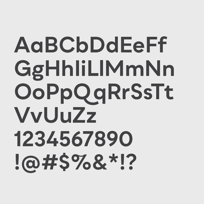
Qualion is a modern sans-serif geometric font with humanistic and calligraphic inspirations. This font is very versatile and fits well in very clean and minimal designs but at the same time it has terminal shapes and ligatures that make Qualion a very original type of ornamental font. In the empathy brand the font is used in two variants, book and bold using the terminal and intermediate ornate letters that distinguish it though sparingly, never overdoing it.
Some product packaging prototypes and the catalog were also made for this project.