It’s not uncommon for large companies, government entities, and organizations to use more than one logo in their visual communication. NASA, for example, alternates between the classic “meatball” logo from the 1950s and a more modern logotype introduced in the 1970s. But what are the reasons behind this choice? And when does it make sense for a brand to use a dual visual identity?
NASA and the Coexistence of Two Iconic Logos
The case of NASA is emblematic. The American space agency has two official logos: the “meatball” from 1959, featuring the classic red wing and planet, and the more modern red “worm” from 1975.
For many years, these two symbols have coexisted, though not always peacefully. The “worm” was retired in 1992, only to be reintroduced in 2020 for the launch of SpaceX’s Crew Dragon. Today, NASA uses both logos depending on the needs and context.
The reason for this coexistence is that the two logos communicate slightly different messages. The “meatball” conveys tradition and the agency’s early successes, while the “worm” signifies modernity and a desire for innovation. Using them together allows NASA to project a composite image that balances heritage and a push towards the future.
Brand and Product Differentiation
Another reason for maintaining dual logos is to differentiate brands or product lines under the same corporate umbrella.
A classic case is Coca-Cola, whose main logo is used for the iconic drink, while brands like Fanta, Sprite, and Schweppes have their distinct logos. This allows for a diversification of the offering while maintaining a connection to the main brand.
The same strategy is used by conglomerates like Unilever and P&G, which have kept different logos for their numerous brands, maintaining visual consistency that refers back to the parent company. This facilitates targeting different audiences and markets.

Targeting Specific Audiences or Activities
Targeting is another reason to adopt dual logos. Companies with diverse activities can use different symbols for different audiences and divisions.
A clear example is Amazon, whose classic logo with the arrow identifies the e-commerce activity, while Amazon Web Services has a different, more technological AWS logo.
In the nonprofit sector, Save the Children uses its classic logo for the consumer public, while it has created a more institutional “Save the Children International” for activities with government entities and multilateral organizations.
When It Makes Sense to Opt for Dual Logos
In summary, maintaining or introducing a second logo makes sense when there is a need to:
– Differentiate communication between brands and products under the same corporate umbrella
– Communicate more effectively with different audiences and markets
– Convey values or slightly different messages depending on the context
– Balance heritage and innovation for a historic brand
– Identify different business areas or divisions
Clearly, the risks include potential confusion among the public and inconsistencies in the brand image. Therefore, it’s crucial that the logos and their guidelines are well defined and coordinated at a central level.
Other Cases of Companies and Organizations with Dual Logos
Besides NASA, several other entities and companies use more than one logo. Here are a few:
Hewlett-Packard: standard blue/white HP logo, green/white logo to identify the Enterprise division.

Audi: four rings for cars, “Audi Sport” logo for the racing division.

eBay: standard eBay logo, “eBay for Charity” logo to identify charity projects.

Juventus FC: traditional logo, stylized logo used for merchandising.
![]()
Ex Machina: even we have a differentiation in our logo, the blue rectangle with just EXM for the software division and the black rectangle with EXM and Creative for the creative division. The rest of the brand maintains elements in common with the website design and the font used.

As these examples show, the reasons behind the use of dual or triple logos are similar: brand differentiation, targeting specific audiences, identification of business units. It’s up to the company to manage the coexistence to maximize benefits in terms of brand image and recognition.
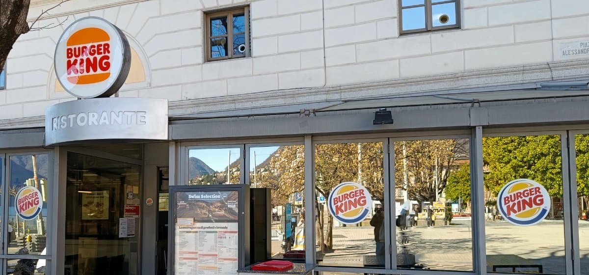
Then there are cases of rebranding where the logo change is not immediate and the old and new logos coexist together for a long time. Currently one of the most prominent examples is Burger King. Having thousands of restaurants the brand update takes time and the old and new logo (or rather say the new updated historical logo) coexist together.
Pros and Cons of Dual Logos
In conclusion, the use of multiple logos can have positive impacts but also risks.
The main advantages are:
– More effective communication with differentiated targets
– Ability to convey different messages
– Differentiation between brands and products
– Balance between heritage and innovation
The disadvantages to carefully consider:
– Possible confusion among the public
– Difficulty in managing a consistent image
– Higher creation and management costs
Ultimately, having dual or triple logos can be a winning strategic choice for large companies and complex organizations. But it requires clarity in brand image strategy and flawless execution to balance benefits and risks.
The coexistence of multiple visual identities must be managed logically, with coordination, and great communicative consistency. When these elements are lacking, the risk of confusion and weakening of the brand becomes real.
EXM /creative creates brands or restyling existing brands, applying them to the web, social and all company communication. Stay in touch by signing up for our newsletter on LinkedIn, link at the bottom of the page.